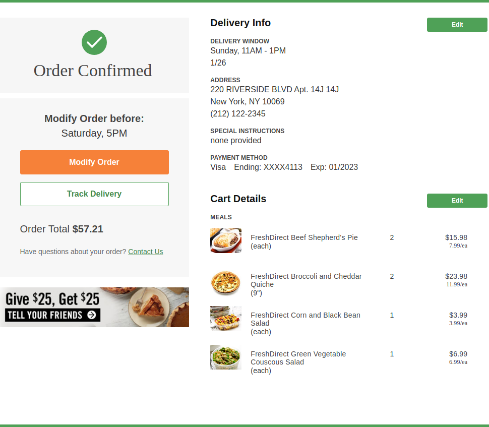
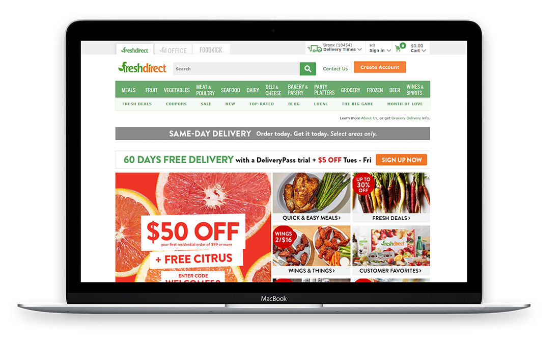
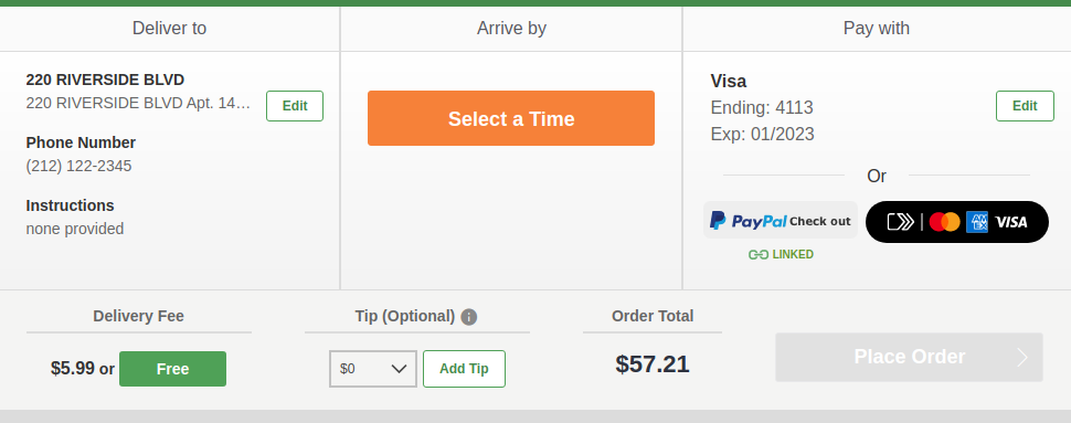
Transform an often cumbersome multi-step checkout to a single page checkout experience. Implement the new and simplified UX based on existing funcionalities handling payment methods, corporate and residential addresses, extensive time-slot options anda changing product inventory.
Business Analysis - Project Management - Web development - QA
Implementing a major challenge like this required us to work closely with FreshDirect's UX Business, IT and QA teams. During the development we had to analyze and understand the ongoing checkout rules, processes, and validations. With this change, we had to tailor the add to cart functionality to support the new cart and checkout flow and align all the verification processes leading to order confirmation. Besides providing a new and simplified user experience to the end customer the new feature needed to get to the CRM team handling occasional complaints on orders.
Java, Google Closure Templates, JavaScript
The initial ccustomer feedback was positive. The original checkout experience consisted of 4 to 10+ pages based on each individual case. After the change customers are able to use a single page checkout as a faster, more efficient way of buying groceries online.
Code and soda remains FreshDirect's technology partner of choice, offering ongoing business analysis, consulting, web development services and support.


